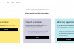
15 minute mockup for a friend

A friend is in the process of growing a Brighton themed blog and sent me this over for feedback.
My comments were
- its busy and confusing to the eye – we need better object hierarchy to direct the viewer to the important information.
- the cursive font is hard to read, even when not surrounded by seagulls on all sides
- the date/time/address labels weren’t really necessary, and we needed to cut down some of the excess text on the page
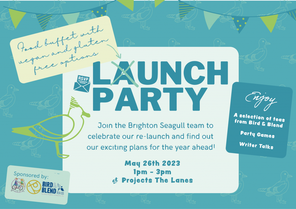
I created a mockup redesign – relying on image trace in illustrator to isolate and recreate the important elements. I didn’t bother identifying the font to design it perfectly, and instead chose one with a similar vibe for this 15 minute mockup.
I wanted to keep the chaotic seagull background in a more subtle way so I changed them to midtones with low contrast against the background.
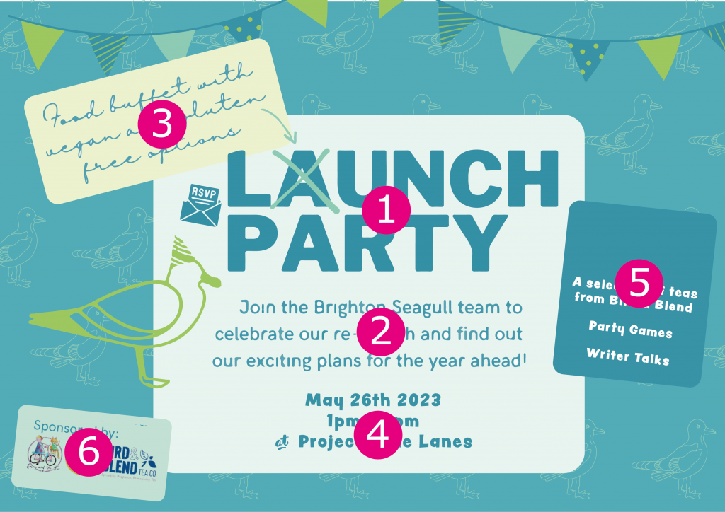
The eye is drawn to the important areas first. I believe the viewer should observe the items in this order (although 3 and 4 may be switched).
All of the information is eaasy to locate, and legible – especially the writing on the right that was originally in cursive. It’s more easily read and understood.
The background design allowed me to avoid culling even a single seagull, and we still draw them into focus throughout the design, The darker colour also creates easy contrast, again helping the eye navigate the page.
She was thrilled and asked to use this as “a very close reference” so I think it was a successful redesign!